Follow

 |
 |
 |
 |
 |  |
 |
 |
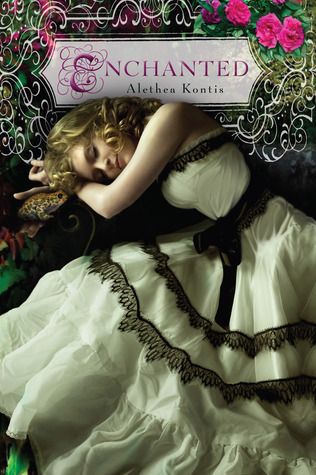
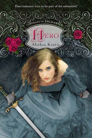
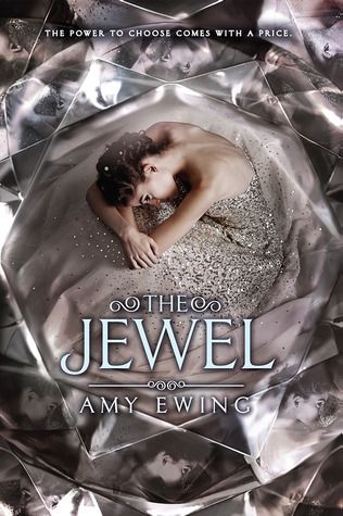
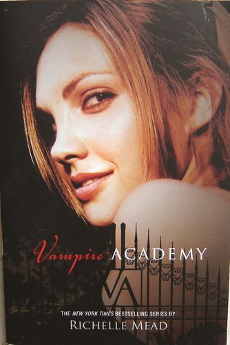
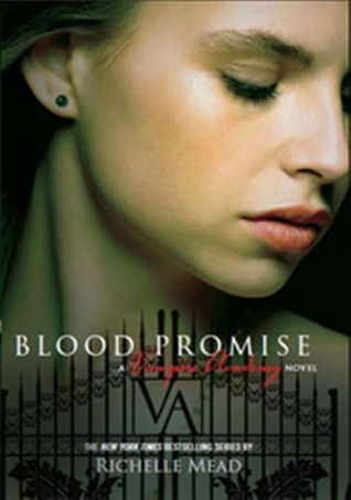
One trend that's very common is "girl in a dress", it's everywhere and it's getting kind of old, but there are still some gorgeous covers:
 |
 |
 |
 |
 |
 |  |
 |
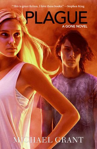
Finally, some covers I dislike: giant floating heads!
 |
 |  |
 |
 |
 |  |
 |
7 comments:
-
Cora @ Tea Party Princess said...

-
Bwahahaha. Love your list. I don't like the constipated people either.
Cora @ Tea Party Princess -
June 24, 2014 at 2:36 AM

-
Ula @ Blog of Erised said...
-
LOL last two, totally agree though!
Symbols and big titles are really good though, I love those.
Good picks! -
June 24, 2014 at 10:18 AM
-
Elizabeth @ Book YAbber said...
-
LOL to that last one. I literally almost lost the water I was drinking due to laughing so hard!
I like book cover that use symbols from the book on the front cover too. It gives a nice visual! -
June 24, 2014 at 10:44 AM
-
Stefani Sloma said...
-
The cover for The Darkest Part of the Forest is beautiful! Love that.
Also, death to giant floating heads on covers! It's the worst. -
June 24, 2014 at 11:31 AM
-
Selah @ A Bibliophile's Style said...
-
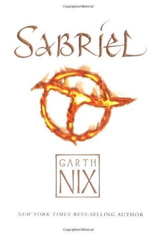
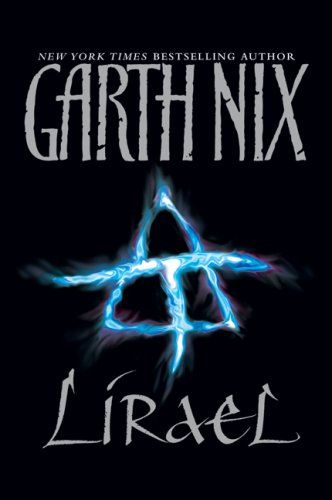
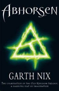
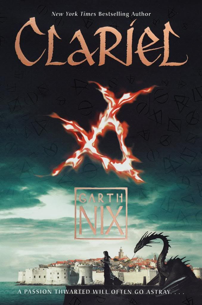
I love the new Abhorsen series covers - especially since the symbols really do tie into the story. :)
-
June 24, 2014 at 11:57 AM
-
La Coccinelle said...
-
No... look constipated and worried. Or maybe just look worried because you're constipated. In any case, I see what you mean. Those covers don't really tell me much about what's in the books (except maybe that there's a lot of teenage angst).
-
June 24, 2014 at 9:04 PM
-
Wendy said...
-
Ahh yes, I never liked the VA book covers as much as I love the series!! And LOL to the last one, hahaha. I LOVE the newly released abhorsen covers!
-
June 24, 2014 at 9:32 PM
Tuesday, June 24, 2014
Top Ten Tueday: Top Ten Book Cover Trends
|
|
|
|
| |
|
|
One trend that's very common is "girl in a dress", it's everywhere and it's getting kind of old, but there are still some gorgeous covers:
|
|
|
|
|
| |
|
Finally, some covers I dislike: giant floating heads!
|
| |
|
|
| |
|

Bwahahaha. Love your list. I don't like the constipated people either.
ReplyDeleteCora @ Tea Party Princess
LOL last two, totally agree though!
ReplyDeleteSymbols and big titles are really good though, I love those.
Good picks!
LOL to that last one. I literally almost lost the water I was drinking due to laughing so hard!
ReplyDeleteI like book cover that use symbols from the book on the front cover too. It gives a nice visual!
The cover for The Darkest Part of the Forest is beautiful! Love that.
ReplyDeleteAlso, death to giant floating heads on covers! It's the worst.
I love the new Abhorsen series covers - especially since the symbols really do tie into the story. :)
ReplyDeleteNo... look constipated and worried. Or maybe just look worried because you're constipated. In any case, I see what you mean. Those covers don't really tell me much about what's in the books (except maybe that there's a lot of teenage angst).
ReplyDeleteAhh yes, I never liked the VA book covers as much as I love the series!! And LOL to the last one, hahaha. I LOVE the newly released abhorsen covers!
ReplyDelete