Contact Me
Blog Archive
-
▼
2014
(61)
-
▼
June
(13)
- Early Review: One Plus One by Jojo Moyes
- Waiting on Wednesday: The Jewel by Amy Ewing
- Top Ten Tueday: Top Ten Book Cover Trends
- Stacking the Shelves #1
- Waiting on Wednesday: Waiting on Trial by Fire
- Review: The Naturals by Jennifer Lynne Barnes
- Top Ten Tuesday: Top Ten Books on My Summer TBR List
- Waiting on Wednesday: The Magician's Land
- Top 10 Tuesday: Top Ten Books I've read so far thi...
- Review: The Glass Casket by McCormick Templeman
- Waiting on Wednesday: Waiting on Otherbound by Cor...
- Top Ten Tuesday: Top 10 Books in My Beach Bag
- Review: Death Sworn by Leah Cypess
-
▼
June
(13)
Pages
Labels
- #WeNeedDiverseBooks (1)
- 1 Lonely Star (1)
- 2 Stars (1)
- 2013 Debut (4)
- 3 Stars (3)
- 3+ Stars (3)
- 4 Stars (11)
- 4+ Stars (9)
- 5 stars (4)
- Adult (1)
- always time for 30 rock gifs (1)
- Angels? Maybe (1)
- ARC (1)
- Arc Review (1)
- Assasins! (1)
- Awesome female characters (1)
- Boarding school shenanigans (1)
- Book Haul (1)
- Books Everywhere! (1)
- BoutofBooks (6)
- Challenge (3)
- Contemporary Romance (2)
- cover art (1)
- Creeptastic (2)
- D for Disappointment (1)
- Debut (1)
- Disabled character (1)
- Discussion (1)
- disregard (1)
- Diverse Books (1)
- Dystopian (1)
- Fairytale (3)
- Fantasy (8)
- Feature and Follow (10)
- Ghosts (4)
- Giveaway! (1)
- Gothic (5)
- Historical (1)
- Horror (1)
- I did my waiting 15 years of it. (1)
- I feel you romance I feel you (2)
- Jaime vents her spleen (2)
- magical adventures hooray! (8)
- Maintenance (1)
- Meme (50)
- Middle Grade (3)
- Murder Mystery! (2)
- Not a fan of mermaids it's a character flaw (1)
- Photo inserts (1)
- Post-apocalyptic (1)
- Psychic Abilities (1)
- Readathon (8)
- recommended with reservations (1)
- Review (25)
- RIPIX (3)
- RIPVIII (2)
- Selkies (1)
- serial killers (1)
- Shameful secrets (1)
- sometimes angel books sneak in undetected (1)
- Stacking the Shelves (2)
- Sunday Post (3)
- Superpowers (1)
- Thriller (2)
- Top Ten Tuesday (33)
- Urban Fantasy (1)
- Vampires (1)
- Waiting on Wednesday (17)
- YA (4)
About Me
 |
 |
 |
 |
 |  |
 |
 |
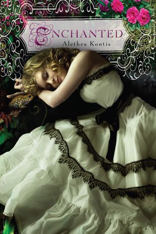
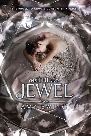
One trend that's very common is "girl in a dress", it's everywhere and it's getting kind of old, but there are still some gorgeous covers:
 |
 |
 |
 |
 |
 |
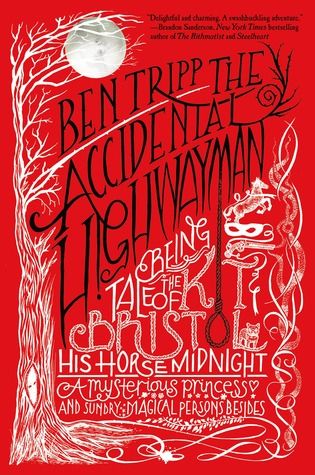 |
Finally, some covers I dislike: giant floating heads!
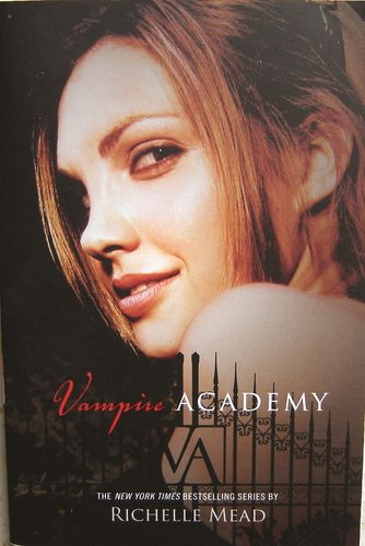 |
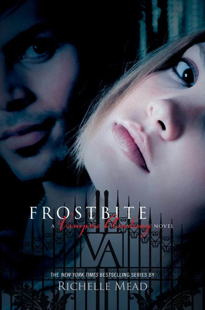 |  |
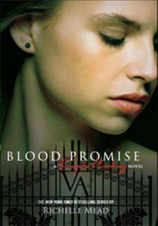 |
 |
 |  |
 |
7 comments:
- Cora @ Tea Party Princess said...
-
Bwahahaha. Love your list. I don't like the constipated people either.
Cora @ Tea Party Princess -
June 24, 2014 at 2:36 AM

-
Ula @ Blog of Erised said...

-
LOL last two, totally agree though!
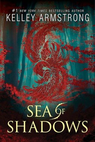
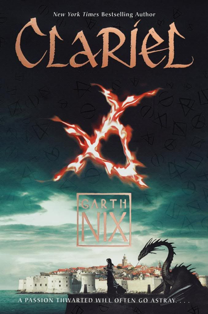
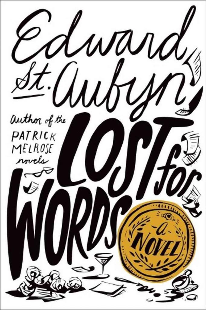
Symbols and big titles are really good though, I love those.
Good picks! -
June 24, 2014 at 10:18 AM

- Elizabeth @ Book YAbber said...
-
LOL to that last one. I literally almost lost the water I was drinking due to laughing so hard!
I like book cover that use symbols from the book on the front cover too. It gives a nice visual! -
June 24, 2014 at 10:44 AM

- Stefani Sloma said...
-
The cover for The Darkest Part of the Forest is beautiful! Love that.
Also, death to giant floating heads on covers! It's the worst. -
June 24, 2014 at 11:31 AM

- Selah @ A Bibliophile's Style said...
-
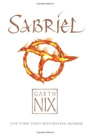
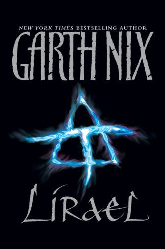
I love the new Abhorsen series covers - especially since the symbols really do tie into the story. :)
-
June 24, 2014 at 11:57 AM

-
La Coccinelle said...

-
No... look constipated and worried. Or maybe just look worried because you're constipated. In any case, I see what you mean. Those covers don't really tell me much about what's in the books (except maybe that there's a lot of teenage angst).
-
June 24, 2014 at 9:04 PM

-
Wendy said...

-
Ahh yes, I never liked the VA book covers as much as I love the series!! And LOL to the last one, hahaha. I LOVE the newly released abhorsen covers!
-
June 24, 2014 at 9:32 PM

Tuesday, June 24, 2014
Top Ten Tueday: Top Ten Book Cover Trends
 |
 |
 |
 |
 |  |
 |
 |
One trend that's very common is "girl in a dress", it's everywhere and it's getting kind of old, but there are still some gorgeous covers:
 |
 |
 |
 |
 |
 |
 |
Finally, some covers I dislike: giant floating heads!
 |
 |  |
 |
 |
 |  |
 |


Bwahahaha. Love your list. I don't like the constipated people either.
ReplyDeleteCora @ Tea Party Princess
LOL last two, totally agree though!
ReplyDeleteSymbols and big titles are really good though, I love those.
Good picks!
LOL to that last one. I literally almost lost the water I was drinking due to laughing so hard!
ReplyDeleteI like book cover that use symbols from the book on the front cover too. It gives a nice visual!
The cover for The Darkest Part of the Forest is beautiful! Love that.
ReplyDeleteAlso, death to giant floating heads on covers! It's the worst.
I love the new Abhorsen series covers - especially since the symbols really do tie into the story. :)
ReplyDeleteNo... look constipated and worried. Or maybe just look worried because you're constipated. In any case, I see what you mean. Those covers don't really tell me much about what's in the books (except maybe that there's a lot of teenage angst).
ReplyDeleteAhh yes, I never liked the VA book covers as much as I love the series!! And LOL to the last one, hahaha. I LOVE the newly released abhorsen covers!
ReplyDelete