Contact Me
Blog Archive
-
▼
2013
(86)
-
▼
November
(17)
- Waiting on Wednesday: Waiting on Dorothy Must Die
- Top Ten Tuesday: Book Recs for a kid (or anyone) m...
- Sunday Post #5
- Review: The Twistrose Key
- Feature & Follow Friday: Movie Adaptations
- Waiting on Wednesday: Waiting on: Death Sworn By L...
- Top Ten Tuesday: Top Ten Covers I Would Redesign
- Review: The Paris Architect
- Sunday Post # 4
- Silly Summaries for Saturday
- Feature & Follow Friday, V-log addition. Or is it?
- Review: Vicious by Victoria Schwab
- Waiting on Wednesday: Waiting on The Young World
- Top Ten Tuesday: Top Ten Sequels I Can't Wait to G...
- Review: The Beginning of Everything
- Sunday Post # 3: A week in summary and birthday stuff
- Feature & Follow Friday: Embarrassing books edition
-
▼
November
(17)
Pages
Labels
- #WeNeedDiverseBooks (1)
- 1 Lonely Star (1)
- 2 Stars (1)
- 2013 Debut (4)
- 3 Stars (3)
- 3+ Stars (3)
- 4 Stars (11)
- 4+ Stars (9)
- 5 stars (4)
- Adult (1)
- always time for 30 rock gifs (1)
- Angels? Maybe (1)
- ARC (1)
- Arc Review (1)
- Assasins! (1)
- Awesome female characters (1)
- Boarding school shenanigans (1)
- Book Haul (1)
- Books Everywhere! (1)
- BoutofBooks (6)
- Challenge (3)
- Contemporary Romance (2)
- cover art (1)
- Creeptastic (2)
- D for Disappointment (1)
- Debut (1)
- Disabled character (1)
- Discussion (1)
- disregard (1)
- Diverse Books (1)
- Dystopian (1)
- Fairytale (3)
- Fantasy (8)
- Feature and Follow (10)
- Ghosts (4)
- Giveaway! (1)
- Gothic (5)
- Historical (1)
- Horror (1)
- I did my waiting 15 years of it. (1)
- I feel you romance I feel you (2)
- Jaime vents her spleen (2)
- magical adventures hooray! (8)
- Maintenance (1)
- Meme (50)
- Middle Grade (3)
- Murder Mystery! (2)
- Not a fan of mermaids it's a character flaw (1)
- Photo inserts (1)
- Post-apocalyptic (1)
- Psychic Abilities (1)
- Readathon (8)
- recommended with reservations (1)
- Review (25)
- RIPIX (3)
- RIPVIII (2)
- Selkies (1)
- serial killers (1)
- Shameful secrets (1)
- sometimes angel books sneak in undetected (1)
- Stacking the Shelves (2)
- Sunday Post (3)
- Superpowers (1)
- Thriller (2)
- Top Ten Tuesday (33)
- Urban Fantasy (1)
- Vampires (1)
- Waiting on Wednesday (17)
- YA (4)
About Me
This week's topic: Top Ten Covers I wish I could redesign.
 |
 |
8 comments:
-
Anonymous said...

-
Generic pretty faces are a major pet peeve for me too! It doesn't tell me anything about the book, and pieces of bodies are pretty boring to look at.
-
November 12, 2013 at 12:40 AM

-
Anonymous said...

-
I'm not a fan of the Vampire Academy covers. They could be made so much more exciting.
-
November 12, 2013 at 1:22 AM

-
Anonymous said...

-
I think I cracked a rib laughing at the cover of Resetting the Hero.
My TTT -
November 12, 2013 at 8:10 AM

- Unknown said...
-
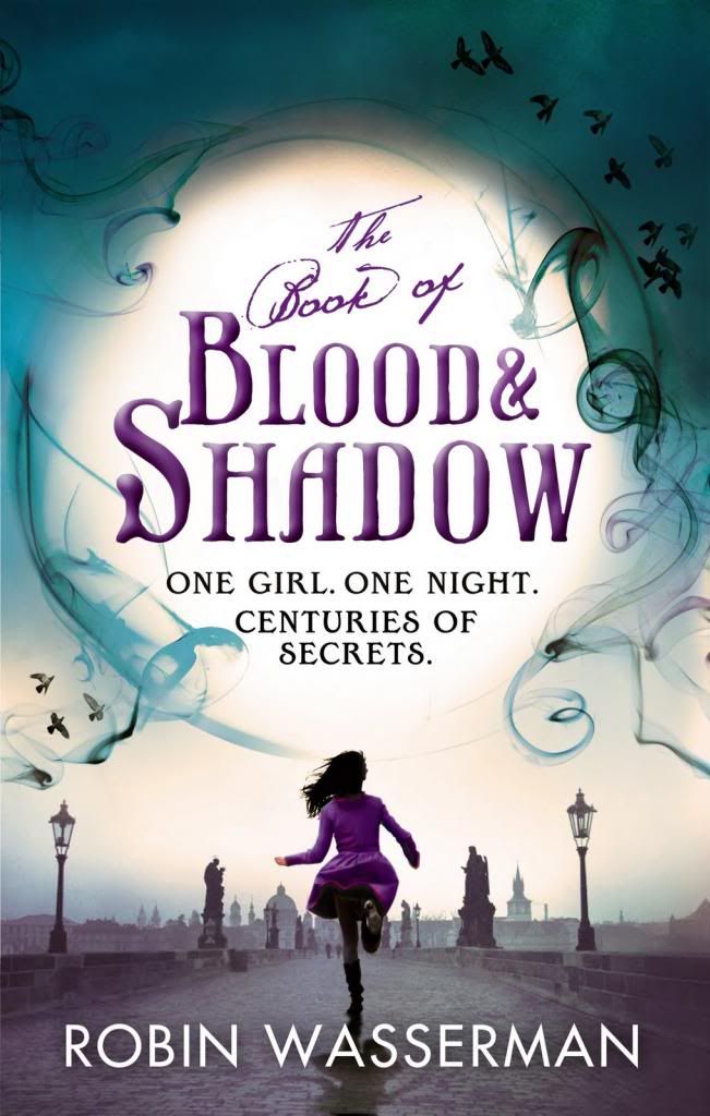
I agree with all of these! Personally I prefer the Book of Blood and Shadow version with the running girl wearing something purple. So pretty~
My TTT! -
November 12, 2013 at 1:43 PM

- Charnell @ Reviews from a Bookworm said...
-
Heehee I agree with all. VA made my list too, they are really boring covers and the girl looks like a young Angelina Jolie as well. My TTT.
-
November 12, 2013 at 2:32 PM

- Katie said...
-
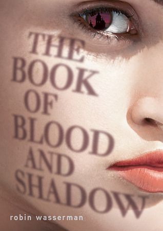
I like The Book of Blood and Shadow cover. It is very creative how the title is a shadow on the girl's face. Her make-up is a little extreme, though.
Check out my TTT list: http://www.booksavvyblog.blogspot.com/ -
November 12, 2013 at 3:21 PM

- Doris @ OABR said...
-
I'm actually a fan of The Girl of Fire & Thorns cover, I think its perfect =)
Check out Our TTT
Doris @ OABR -
November 12, 2013 at 6:01 PM

- Vilia said...
-
I think they have definitely gone for pretty over something that reflects the novel - unless there really is a giant girl stomping around an academy.
-
November 14, 2013 at 5:41 AM

Tuesday, November 12, 2013
Top Ten Tuesday: Top Ten Covers I Would Redesign
This week's topic: Top Ten Covers I wish I could redesign.
 |
 |








Generic pretty faces are a major pet peeve for me too! It doesn't tell me anything about the book, and pieces of bodies are pretty boring to look at.
ReplyDeleteI'm not a fan of the Vampire Academy covers. They could be made so much more exciting.
ReplyDeleteI think I cracked a rib laughing at the cover of Resetting the Hero.
ReplyDeleteMy TTT
I agree with all of these! Personally I prefer the Book of Blood and Shadow version with the running girl wearing something purple. So pretty~
ReplyDeleteMy TTT!
Heehee I agree with all. VA made my list too, they are really boring covers and the girl looks like a young Angelina Jolie as well. My TTT.
ReplyDeleteI like The Book of Blood and Shadow cover. It is very creative how the title is a shadow on the girl's face. Her make-up is a little extreme, though.
ReplyDeleteCheck out my TTT list: http://www.booksavvyblog.blogspot.com/
I'm actually a fan of The Girl of Fire & Thorns cover, I think its perfect =)
ReplyDeleteCheck out Our TTT
Doris @ OABR
I think they have definitely gone for pretty over something that reflects the novel - unless there really is a giant girl stomping around an academy.
ReplyDelete