Contact Me
Blog Archive
-
▼
2013
(86)
-
▼
November
(17)
- Waiting on Wednesday: Waiting on Dorothy Must Die
- Top Ten Tuesday: Book Recs for a kid (or anyone) m...
- Sunday Post #5
- Review: The Twistrose Key
- Feature & Follow Friday: Movie Adaptations
- Waiting on Wednesday: Waiting on: Death Sworn By L...
- Top Ten Tuesday: Top Ten Covers I Would Redesign
- Review: The Paris Architect
- Sunday Post # 4
- Silly Summaries for Saturday
- Feature & Follow Friday, V-log addition. Or is it?
- Review: Vicious by Victoria Schwab
- Waiting on Wednesday: Waiting on The Young World
- Top Ten Tuesday: Top Ten Sequels I Can't Wait to G...
- Review: The Beginning of Everything
- Sunday Post # 3: A week in summary and birthday stuff
- Feature & Follow Friday: Embarrassing books edition
-
▼
November
(17)
Pages
Powered by Blogger.
Labels
- #WeNeedDiverseBooks (1)
- 1 Lonely Star (1)
- 2 Stars (1)
- 2013 Debut (4)
- 3 Stars (3)
- 3+ Stars (3)
- 4 Stars (11)
- 4+ Stars (9)
- 5 stars (4)
- Adult (1)
- always time for 30 rock gifs (1)
- Angels? Maybe (1)
- ARC (1)
- Arc Review (1)
- Assasins! (1)
- Awesome female characters (1)
- Boarding school shenanigans (1)
- Book Haul (1)
- Books Everywhere! (1)
- BoutofBooks (6)
- Challenge (3)
- Contemporary Romance (2)
- cover art (1)
- Creeptastic (2)
- D for Disappointment (1)
- Debut (1)
- Disabled character (1)
- Discussion (1)
- disregard (1)
- Diverse Books (1)
- Dystopian (1)
- Fairytale (3)
- Fantasy (8)
- Feature and Follow (10)
- Ghosts (4)
- Giveaway! (1)
- Gothic (5)
- Historical (1)
- Horror (1)
- I did my waiting 15 years of it. (1)
- I feel you romance I feel you (2)
- Jaime vents her spleen (2)
- magical adventures hooray! (8)
- Maintenance (1)
- Meme (50)
- Middle Grade (3)
- Murder Mystery! (2)
- Not a fan of mermaids it's a character flaw (1)
- Photo inserts (1)
- Post-apocalyptic (1)
- Psychic Abilities (1)
- Readathon (8)
- recommended with reservations (1)
- Review (25)
- RIPIX (3)
- RIPVIII (2)
- Selkies (1)
- serial killers (1)
- Shameful secrets (1)
- sometimes angel books sneak in undetected (1)
- Stacking the Shelves (2)
- Sunday Post (3)
- Superpowers (1)
- Thriller (2)
- Top Ten Tuesday (33)
- Urban Fantasy (1)
- Vampires (1)
- Waiting on Wednesday (17)
- YA (4)
About Me
Tuesday, November 12, 2013
hosted by The Broke and the Bookish
This week's topic: Top Ten Covers I wish I could redesign.
1.
The white-washing of this cover has been discussed in many other places, but it's a tragically missed opportunity to feature a character who's a POC and not supermodel skinny.
2.
The buildings in the eye effect is kind of cool, but I'm not a fan of what I refer to as "extreme close-up". It's off-putting. Also, the UK and paperback editions are much better imo:
![]() |
![]() |
3.
This is another extreme close-up, focusing on the lips for some mysterious reason. While the tree branches make sense the sparkly gold lipstick does not.
4.
More face in my face. I find this pretty boring. The same goes for all the covers for this series.
5.
That is a giant head floating over a gate. It's also partly why it took me so long to start this series.
6.
I'm being punished for my weird vendetta against face covers with this borderline nightmare fuel, changed from the original pretty floral cover.
7.
This cover is straight up terrible. The title's "hero" isn't white. Nothing about this reflects the book accurately. (Btw, I do recommend this series for anyone looking for a good, if untraditional romance with a scifi/fantasy setting and diverse characters)
That's all I could come up with for today. I'm really not that particular when it comes to covers, the above complaints aside :).
Labels:
Meme,
Top Ten Tuesday
Subscribe to:
Post Comments (Atom)
Tuesday, November 12, 2013
Top Ten Tuesday: Top Ten Covers I Would Redesign
hosted by The Broke and the Bookish
This week's topic: Top Ten Covers I wish I could redesign.
1.
The white-washing of this cover has been discussed in many other places, but it's a tragically missed opportunity to feature a character who's a POC and not supermodel skinny.
2.
The buildings in the eye effect is kind of cool, but I'm not a fan of what I refer to as "extreme close-up". It's off-putting. Also, the UK and paperback editions are much better imo:
![]() |
![]() |
3.
This is another extreme close-up, focusing on the lips for some mysterious reason. While the tree branches make sense the sparkly gold lipstick does not.
4.
More face in my face. I find this pretty boring. The same goes for all the covers for this series.
5.
That is a giant head floating over a gate. It's also partly why it took me so long to start this series.
6.
I'm being punished for my weird vendetta against face covers with this borderline nightmare fuel, changed from the original pretty floral cover.
7.
This cover is straight up terrible. The title's "hero" isn't white. Nothing about this reflects the book accurately. (Btw, I do recommend this series for anyone looking for a good, if untraditional romance with a scifi/fantasy setting and diverse characters)
That's all I could come up with for today. I'm really not that particular when it comes to covers, the above complaints aside :).
Subscribe to:
Post Comments (Atom)
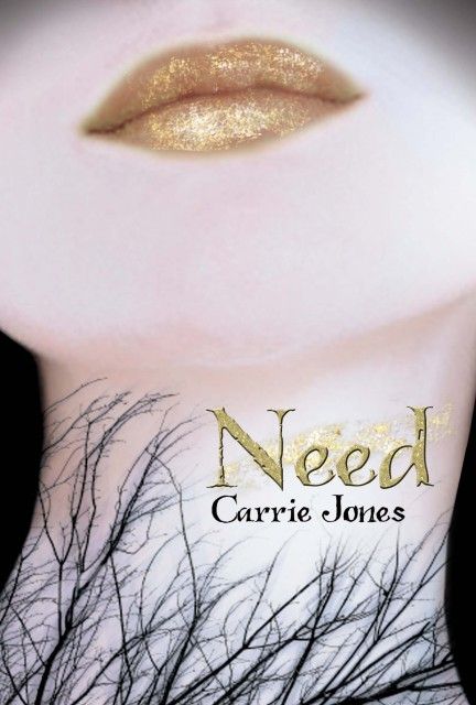
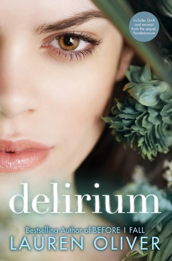
Generic pretty faces are a major pet peeve for me too! It doesn't tell me anything about the book, and pieces of bodies are pretty boring to look at.
ReplyDelete
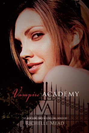
I'm not a fan of the Vampire Academy covers. They could be made so much more exciting.
ReplyDelete
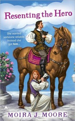
I think I cracked a rib laughing at the cover of Resetting the Hero.
ReplyDeleteMy TTT
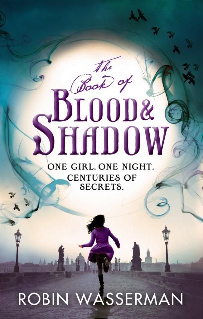
I agree with all of these! Personally I prefer the Book of Blood and Shadow version with the running girl wearing something purple. So pretty~
ReplyDeleteMy TTT!
Heehee I agree with all. VA made my list too, they are really boring covers and the girl looks like a young Angelina Jolie as well. My TTT.
ReplyDelete
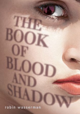
I like The Book of Blood and Shadow cover. It is very creative how the title is a shadow on the girl's face. Her make-up is a little extreme, though.
ReplyDeleteCheck out my TTT list: http://www.booksavvyblog.blogspot.com/
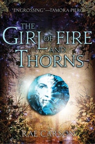
I'm actually a fan of The Girl of Fire & Thorns cover, I think its perfect =)
ReplyDeleteCheck out Our TTT
Doris @ OABR
I think they have definitely gone for pretty over something that reflects the novel - unless there really is a giant girl stomping around an academy.
ReplyDelete